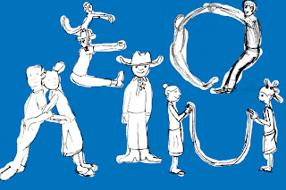
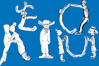
reworking the mural composition in photoshop. the plan is to blow this up and print it out, lightly trace where each figure goes, and then completely redraw everything so it doesn't look like shit. maybe I can get my roommates to pose for reference. Here are two slightly different compositions I am currently working with (I put blue in the background for clarity) along with my first composition. improvement?


No comments:
Post a Comment